


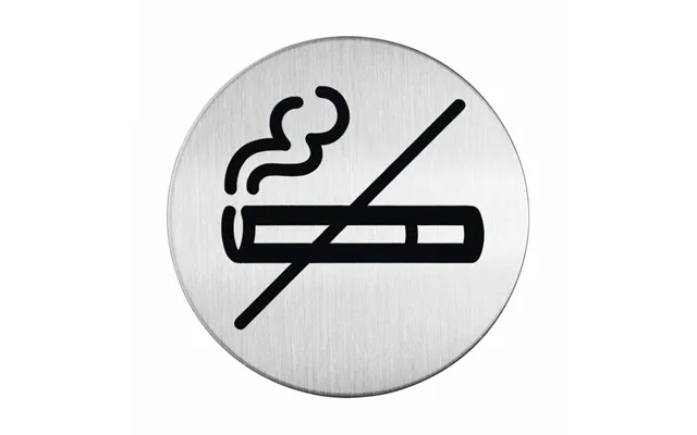
Policy Signs price list
Last updated Thursday, 12 Nov 2026
| Policy Signs | Price |
|---|---|
| Durable Picto No Smoking Round Silver Stainless Steel | £12.67 |

Loading...
Last updated Thursday, 12 Nov 2026
| Policy Signs | Price |
|---|---|
| Durable Picto No Smoking Round Silver Stainless Steel | £12.67 |
Policy signs are the quiet heroes of every workplace. They tell customers, visitors, and staff exactly what’s expected—clearly and confidently. Whether it’s “No Smoking,” “CCTV in Operation,” “Handwashing Required,” or “PPE Must Be Worn,” these signs reduce confusion, prevent accidents, and help your business stay compliant. If you’ve ever walked into a shop, office, warehouse, or café and immediately understood the rules without asking anyone, you’ve seen the power of policy signage at work.
In the UK, clear signage isn’t just a nice-to-have; in many cases, it’s part of good workplace practice and essential compliance. Think about smoke-free rules requiring “No Smoking” notices, health and safety expectations around PPE and hand hygiene, data protection guidance for surveillance signage, and access control for restricted areas. When policy signs are professional, visible, and consistent, you protect people and your brand. You also reduce training time because your environment speaks for itself.
Wondering which signs your business should prioritize? Start with the essentials, then tailor to your environment. “No Smoking/No Vaping” signs are classics for entrances and common spaces. “CCTV in Operation” signage is common anywhere surveillance is used. Hygiene policy signs—like “Wash Hands,” “Sanitize Here,” or “Food Preparation Area—Authorized Staff Only”—are indispensable in kitchens and healthcare settings. For industrial and construction sites, “Hard Hats Required,” “High-Visibility Clothing Must Be Worn,” and “Hearing Protection Required” get straight to the point. Offices and retail spaces often need “Staff Only,” “Queue Here,” “Contactless Preferred,” and “No Food or Drink” signs to guide behavior without friction.
Materials matter more than you might think. Aluminum signs are tough, weather-resistant, and look professional indoors or out—great for gates, loading bays, and external doors. Rigid plastic is cost-effective and durable for indoor use, especially in corridors, meeting rooms, and facilities. Acrylic delivers a high-end look for reception areas, front-of-house, and customer-facing interiors. Vinyl decals work brilliantly on windows, mirrors, doors, and tiled walls; they’re versatile, sleek, and easy to replace if messages change. Magnetic signs are handy for temporary policies or movable equipment. Think about where your sign will live, the level of wear-and-tear, and the temperature, moisture, or sunlight exposure it will face before deciding.
Size and readability go hand in hand. For entrances and outdoor areas, signs around 10 x 14 in or 12 x 18 in are easy to spot from a distance. For doors and internal walls, 8 x 12 in or 7 x 10 in generally hits the sweet spot—big enough to be seen, small enough to fit tight spaces. Desktop or reception counter notices work well at 5 x 7 in. Small door plates like 3 x 9 in are perfect for concise messages—think “Private,” “Staff Only,” or “Visitors Sign In.” If the sign needs to be read from farther than a few paces, go bigger—your future self will thank you.
Good design is the difference between a sign people notice and one they walk past without a glance. High contrast is essential—dark text on a light background or vice versa. Use bold, plain fonts that are easy to read at a distance. Keep messaging short and decisive: “No Entry,” “Fire Exit Keep Clear,” “Face Masks Required,” and “CCTV in Operation” all work because they’re direct. Pictograms and universally recognized symbols help users grasp the message in a split second. If you’re creating branded signage, align colors sensibly without sacrificing clarity—safety and compliance come first, style a close second. And don’t be shy about white space; it makes the message pop.
Color cues help users decode a sign quickly. Prohibition signs typically use red to signal “Do not” or “Stop.” Mandatory action signs often lean on blue to say “You must.” Warnings use yellow to say “Be careful,” while information and notice signs can use green or blue for guidance. Keep your main message at the top in larger text, with brief secondary info below—like who to contact, operating times, or special instructions.
Placement is half the battle. Put your most important messages at decision points—entrances, exits, gates, reception, stairwells, lifts, and doorways leading to restricted areas. Position PPE requirements at the threshold to the zone where they apply; that way, people get the message before entering. Hygiene signs belong at sinks and kitchen entrances, while payment and customer conduct signs work best near tills and queue lines. Outdoors, mount signs at eye level on fences and walls where traffic flows naturally. Indoors, aim for consistent heights across similar signs to create a clean, professional look.
If you stack too many signs together, people tune them out. Instead, group policies logically—safety notices in one clear cluster, customer notices in another—and give each sign enough breathing room. When messages change seasonally or temporarily, swap out signs rather than adding more layers. Less clutter, more clarity.
Installation doesn’t need to be a headache. For permanent mounting on walls or doors, pre-drilled holes with screws deliver a rock-solid fix. For railings and fencing, use cable ties with pre-drilled signs—quick and secure. On smooth indoor surfaces like glass or tile, high-tack adhesive pads or vinyl decals are simple and mess-free. For a premium lobby look, use standoffs that hold an acrylic or aluminum panel off the wall by about 0.5 to 1 in—sleek and modern. If your policy is temporary, magnetic signs or repositionable vinyl give you flexibility without leaving residue behind.
If the sign is going outdoors, make sure it’s UV-stable and weather-resistant. UV-resistant inks keep colors from fading in sunlight, and laminated finishes add a protective layer against scratches, moisture, and graffiti. For indoor kitchens, bathrooms, and high-humidity zones, moisture-resistant materials like sealed acrylic or laminated rigid plastic will stay crisp longer.
Not all workplaces need the same messages. In retail, “Queue Here,” “Contactless Preferred,” “No Food or Drink,” and “CCTV in Operation” keep things orderly and secure. Hospitality venues benefit from “Allergens Info Available,” “Please Wait to Be Seated,” “No Outside Food or Drink,” and “Staff Only.” Offices often need “Hot Desk Etiquette,” “Quiet Zone—Please Keep Noise Low,” and “Meeting Room in Use.” In warehouses and construction sites, focus on PPE requirements, speed limits for vehicles, designated walkways, and loading zone rules. For healthcare, think hygiene posters, sharps disposal guidance, and visitor-limitation notices. Education settings thrive on clear attendance, safeguarding, and lab safety signage. Tailor policy signs to your context, and your space will run smoother.
Accessible signage helps everyone. Use large, high-contrast text and clear icons so people can quickly understand the message. If space allows, plain-language phrasing makes a big difference. Consider tactile or raised lettering for critical indoor signs, and ensure mounting heights make sense for all users. Clarity is inclusive by design.
Ready-made signs are fast, affordable, and cover most common needs. If you need mainstream messages like “No Smoking,” “Fire Exit Keep Clear,” or “Staff Only,” you’ll find plenty of options ready to go in popular sizes like 8 x 12 in and 10 x 14 in. Custom signs shine when your policies are unique—brand-specific hygiene rules, bespoke lab procedures, or niche visitor instructions. Customization also lets you match your branding, choose premium materials, and add QR codes that link to digital policies or training videos. Weigh your timeline, budget, and how specific your needs are, then choose accordingly.
If a sign sits in a client-facing area—reception, meeting rooms, retail front-of-house—premium finishes like brushed aluminum, crystal-clear acrylic, or glass-effect panels elevate your space. For industrial grit, durable aluminum composite panels with anti-graffiti laminate pay for themselves by staying sharp for longer.
There’s a sweet spot between too few and too many. Start with a walkthrough of your premises from the perspective of a first-time visitor. Can they find the entrance? Understand basic rules? Locate restrooms? Avoid hazards? Navigate to different zones without asking? Wherever the answer is “maybe,” place a sign. If multiple doors look similar, label them. If rules apply to a specific zone—like “PPE Required Beyond This Point”—put the sign right at the threshold. Over time, track recurring questions and incidents; those are clues that you’re missing a message.
Map your space and mark decision points: entry, reception, corridors, stairs, lifts, work zones, storage rooms, and exits. Assign each location the relevant policy sign. Choose sizes based on viewing distance, then standardize materials and fonts for a cohesive look. Finally, set a review cycle—say, every 6 months—to replace worn signs and retire outdated messages.
Even the best signs need a little TLC. Dust, fingerprints, and sunlight can wear them down. Wipe signs with a soft cloth and mild cleaner to keep them looking crisp. Avoid abrasive pads that scratch finishes. If your signs live outdoors, check fixings after storms and reseal edges if needed. Laminated or UV-cured prints last longer under sunlight and are easier to clean. If your policies change frequently, consider modular frames where panels slide in and out—swapping a message becomes a two-minute job.
Policies evolve, and your signage should keep pace. Do an audit whenever you update safety procedures, layout, or customer journey. Remove duplications, fix inconsistencies, and refresh signs that don’t match your current brand or tone. Clear, current signage signals a well-run operation.
If your policy needs more detail than a small panel can handle, add a QR code that links to a full document, training, or an onboarding video. In multilingual environments, consider dual-language signs or symbol-heavy designs for instant recognition. Digital signage works well for rotating messages at reception or break rooms, but keep your core policies on physical signs so they’re always visible, even during a power cut.
Branded signs look sharp when done thoughtfully. Use your logo and brand colors sparingly, and never let low contrast or fancy fonts reduce readability. Remember, policy signs are there to inform first and decorate second. The sweet spot is professional, consistent, and unmistakably yours.
If you’re trying to outfit an entire site or multiple locations, costs can add up quickly. That’s where comparison platforms like ZoneOffer are useful—they help you scan offers across a range of sellers, materials, sizes, and price points so you can lock in the best value. It’s especially handy when you’re buying bundles like 10 or 20 signs at once, or when you want to compare premium acrylic against standard rigid plastic for client-facing areas. Browsing side by side makes it easy to weigh the trade-offs and spot hidden gems.
Before you click “add to cart” anywhere, compare material durability, print quality, mounting options, and warranty terms. Check if signs come pre-drilled, include fixings, or arrive with adhesive pads. Look at size options—8 x 12 in and 10 x 14 in are common sweet spots—and ensure the fonts and symbols are crisp. If you’re ordering custom designs, ask for proofing and color accuracy checks so your brand colors stay consistent across batches.
Imagine a busy café: a neat “Please Wait to Be Seated” sign at the door sets the tone, while “Allergens Info Available—Please Ask” near the counter builds trust. A clear “Staff Only” plate keeps guests out of the kitchen, and a small “Contactless Preferred” card by the till speeds up the queue. In a warehouse, a large “PPE Required Beyond This Point” at the loading dock gate removes any ambiguity. Yellow warning signs mark forklift routes, and “Keep Clear—Fire Exit” plates are mounted at eye level near doors. In a clinic, “Wash Hands Before and After Patient Contact” sits above each sink, while “Sharps Disposal—Use Approved Containers Only” stays right where it’s needed. Each sign is simple, visible, and located exactly where the decision happens.
Tiny text that no one can read, low-contrast colors that blend into the background, too many messages crammed into one panel, and signs placed where people never look—these are the usual suspects. Fix them with bigger sizes, bold contrasts, fewer words, clear icons, and smart placement. When in doubt, do a “10-step test”: walk 10 steps back—can you read it and understand it in two seconds?
Buying signs in bundles saves money and time, especially during a fit-out or refresh. Think in sets: entrance bundle (No Smoking/No Vaping, CCTV in Operation, Opening Instructions), safety bundle (PPE Required, Report Hazards, First Aid), hygiene bundle (Wash Hands, Sanitizing Station, Food Prep Rules), and back-of-house bundle (Staff Only, Stockroom, Break Room Rules). With a plan, you order once, install once, and enjoy a consistent, professional result across every door and wall.
Policies change—design for agility. Use frames that accept swap-in panels, choose materials that print accurately across batches, and keep a style guide for fonts, icons, and colors so new signs match the old ones. When the next update rolls around, you won’t be starting from scratch.
If you need a quick shortlist to get started, here’s a practical lineup many UK businesses rely on every day: “No Smoking/No Vaping,” “CCTV in Operation,” “PPE Required,” “Fire Exit—Keep Clear,” “Staff Only,” “Wash Hands,” “Queue Here,” and “Visitor Sign-In Required.” Pick standard sizes like 8 x 12 in for doors and 10 x 14 in for entrances, choose durable materials, and mount them where decisions happen. That alone will make your space feel more organized, safer, and more professional.
Great policy signs do more than display rules—they set expectations, reduce friction, and make your workplace feel well run. When messages are simple, materials are durable, sizes are appropriate, and placement is strategic, people don’t just see your policies—they follow them. Compare options across materials and bundle deals to keep costs sensible, and think ahead with designs you can update easily. Start with the essentials, tailor to your environment, and let your signs do the quiet, consistent work of keeping everyone informed and on the same page.