

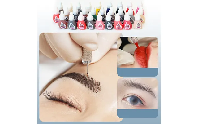
Tattooing Inks price list
Last updated Monday, 19 Oct 2026





Loading...
Last updated Monday, 19 Oct 2026
Tattooing inks are the lifeblood of your art. The right formula flows smoothly, heals predictably, and keeps color true for years. Whether you’re laying down razor-sharp lines or building soft, saturated gradients, ink quality decides how confident you feel in every pass. Think of inks as your palette and your engine at the same time—color theory meets performance. If you’ve ever struggled with patchy fills or inconsistent blacks, chances are your ink choice (and how you’re using it) has a lot to do with it. Looking to elevate your work? Start by understanding what’s inside that bottle and how it behaves on skin.
Hunting for a good deal on tattooing inks in the UK? You’re not alone. Artists keep a close eye on seasonal discounts, bundle pricing, and limited-run sets from major brands. Comparison platforms make it easy to line up prices, spot UK-specific promos, and find the bottle size you want—whether that’s a compact 0.5 oz sample for testing or a studio-ready 8 oz workhorse. Pro tip: watch for brand-authorized sellers and sealed stock, and always scan product photos for batch numbers and tamper-evident caps before you commit. A “cheap” ink that isn’t legit isn’t a bargain—it’s a risk.
Before jumping at a flashy discount, break it down to price per ounce. If a 4 oz bottle costs less than two 2 oz bottles from the same brand and batch series, that’s real value. Bundles are another win—color sets often bring the per-ounce cost down and help you build a consistent palette. Just make sure the shades are ones you’ll use (that neon orange might look cool, but will you actually reach for it?). And remember, reputable comparison pages often show historical pricing, which helps you see if today’s “deal” is actually better than last month’s price.
Price points vary by brand, bottle size, and whether you’re buying single colors, multi-packs, or specialized blacks. In general, you’ll see 1 oz singles priced for entry-level access and testing, 2 oz or 4 oz bottles positioned as studio staples, and larger 8 oz sizes reserved for the shades you burn through—usually black and a few workhorse tones like red or white. Sets are where the math gets interesting: curated palettes of 6, 12, or 24 colors often drop the per-ounce cost and keep color harmony tight across your work. When in doubt, check per-ounce cost and how quickly you’ll use that volume.
Liner black typically commands a premium for flow and saturation, while shader blacks for packing may sit a touch lower if they’re thinner or designed for layering. Specialty whites, opaques, and cover-up tones also trend higher because of their pigment load. If you’re mapping out a budget, prioritize a bulletproof black first, then your most-used skin-tone adjusters and contrast colors. Build outward from there so every dollar works hard in your setup.
Black ink is the backbone of most tattoos, so invest in the good stuff. Look for blacks known for deep saturation, consistent flow, and reliable healing. Many pros favor jet blacks marketed for lining because they remain readable from thin linework to bold outlines. For shading, some artists prefer a smoother black designed to whip and blend without over-saturation. A few notable categories to explore include jet blacks for linework, extra-deep blacks for packing, and pre-dispersed blacks that shake up quickly and stay uniform in the cap.
Liner blacks tend to feel slightly thinner, zipping through skin with minimal drag so your lines stay crisp and less trauma-prone. Shader blacks can be a touch creamier or denser, perfect for smooth gradients and solid fills. Ask yourself: do you like to cut your blacks with a mixing solution, or do you want the bottle doing that heavy lifting for you? If you run both styles regularly, keeping one bottle of fast-flow liner black and one bottle of buttery packer black can cover almost anything.
Colors live or die on the skin by saturation, undertone, and how they layer. Inks known for buttery consistency and high pigment load are easier to pack, and they blend cleanly without turning muddy. For timeless palettes, build around reds, yellows, and blues that punch through on multiple skin tones, then add supporting hues like cool grays, creams, and muted earth tones for realism. Many established color lines offer “signature” sets curated by experienced artists—those can be a fast way to get tried-and-true combinations that heal beautifully.
Single bottles are great for topping up favorites and testing new shades. Sets shine when you want harmony across a project or style, like traditional, neo-traditional, or realism. If you often blend your own hues, a balanced set gives you a predictable base, so you spend less time mixing and more time tattooing. Just keep an eye on duplication—if you already own a few of the included shades, compare the per-ounce price to singles and decide which route truly saves you money.
Many artists and clients now prioritize vegan, cruelty-free inks. Several major brands label their lines accordingly, avoiding animal-derived ingredients while maintaining pro-grade performance. If this matters in your studio, check the product description, ingredient notes, and safety data sheets. Good documentation is a green flag. Another smart move: maintain a clearly labelled vegan-only setup for needles, caps, and aftercare, so you can confidently accommodate client requests without second-guessing what touched what.
Don’t rely on buzzwords alone. Look for detailed ingredient lists, batch numbers, and access to safety data sheets. If a product is marketed as vegan or cruelty-free, the brand should say so plainly and consistently across labels and official materials. When in doubt, compare multiple sources via price-comparison pages and manufacturer links. Transparency usually correlates with quality and accountability.
Viscosity determines how ink flows through your setup and into the skin. Thinner, pre-dispersed inks race through tight liners; creamier inks can feel steadier for packing and blending. Big mag groups often favor inks that cling to the needles just enough to prevent splatter while still laying down effortlessly. Your machine, needle grouping, and hand speed all play a role, so think of viscosity as the gear ratio of your workflow. The wrong thickness feels like pushing a car in sand; the right one feels like coasting downhill.
Start with manufacturer recommendations for the ink you’re using, then adjust needle configuration, hand speed, and stroke to suit. If you find yourself dipping constantly with a liner, try a slightly thicker ink or adjust tension so it carries better. For shading, if your blends jump from dark to light too fast, a creamier ink can help you carry mid-tones longer. Small tweaks stack up to big improvements.
Color doesn’t sit on a blank canvas—skin tone and undertone shape what you see after healing. On deeper tones, aim for high-contrast hues and cleaner value jumps to keep designs readable. On lighter tones, you can push subtlety a bit more, but don’t skip strong anchors like solid black and clearly defined shadows. Whites and very light pastels can be unpredictable across the spectrum, so use them as accents rather than relying on them for structure. The goal? Contrasts that hold up from arm’s length, not just in a close-up photo.
Before committing, load test caps and do tiny swatches on practice media to see how your chosen ink blends with your workflow. If you’re switching brands, compare how quickly each ink saturates, how often you need to dip, and how it heals in your past experience. Creating your own reference boards can save hours of guesswork later.
Quality inks should arrive sealed, clearly labelled, and supported by documentation. Always check the cap, seal, and expiration dates. Keep bottles covered when not in use and never return leftover ink from caps back into the bottle. Set up your station so every client gets fresh, single-use caps and barriered surfaces. And while you’re eyeing deals, stick with legitimate sellers—counterfeits can look convincing but may lack proper safety logging. A clean paper trail is part of a clean tattoo.
Store inks in a cool, dry place away from direct sunlight—generally around 68–77°F is a safe range unless the bottle states otherwise. Shake thoroughly before every session; embedded mixing balls help, but give it a solid shake regardless. If you see separation that won’t resolve, strange clumping, or a damaged seal, retire that bottle. Your client’s skin isn’t the place to “test” questionable ink.
Price comparison is a skill. Start with the basics: per-ounce cost, bottle size, and whether it’s a single color, duo, or full set. Next, look at versioning—some brands refresh formulas or packaging, and older stock might have a lower shelf life. Factor in how fast you’ll use it; a bargain 8 oz bottle isn’t a bargain if you only use a dot of that shade once a month. Finally, read aggregated reviews with a critical eye—consistent comments about flow or saturation carry more weight than one-off raves or rants.
Bundles can be a goldmine: core primaries, greyscale packs, or “artist signature” collections often include must-use shades that keep per-ounce cost down. Starter kits sometimes include extras like sample aftercare (in ounces you can travel with), ink caps, and mixing solutions, which can reduce setup costs if you’re just building your station. Compare the total contents, not just the headline price.
The right accessories amplify your ink performance. Stock a range of ink caps (from small to large), quality squeeze bottles for rinsing, and a mixing solution for fine-tuning viscosity. Disposable palettes, barrier film, and clip cord covers keep everything clean. Consider an ink mixer if you use thicker pigments—it reduces hand fatigue from constant shaking. Also, a reliable white and a dense black belong on every setup; they’re the tire and engine of your color car.
Aftercare can influence how colors look once healed. While artists have personal preferences, aim for gentle, fragrance-light products and ointments that come in clearly labelled ounce sizes so you can recommend consistent use. Keep your advice simple: clean hands, thin layers, and follow the manufacturer’s directions. Well-healed skin makes your ink look like it’s supposed to—no magic, just good habits.
Beginners often do best with a tight palette: a dependable black, a strong white, and a compact set of primary and neutral colors. This reduces decision fatigue and teaches you how each shade behaves. As you advance, expand into undertone-rich sets for realism, pastels for soft touches, and specialty blacks for lining vs. packing. Keep track of what you actually finish. If a color stays dusty for months, replace it with something you reach for every week.
Focus on high-rotation shades in larger bottles—think 4 oz or 8 oz for black—and keep experimental colors in 1 oz or 2 oz until they prove themselves. Buy strategically during sales and bundle events to stock up on your essentials. Over time, your palette should read like a logbook of your style, not a random rainbow of unused bottles.
One common mistake is mixing too many brands too fast. Even great inks feel different from each other; jumping between five formulas in one session can throw off your hand. Another is ignoring seals and batch codes—if something looks off, it probably is. Don’t overlook viscosity either; pushing a thin ink with a big mag at slow hand speed can cause splatter and frustration. Finally, buying huge bottles of rarely used colors might save pennies today but cost you when they expire unused.
Check for crisp labels, consistent fonts, intact seals, and clear batch numbers. Compare product images across multiple reputable listings via a comparison site to catch inconsistencies. If a price seems impossibly low, pause and investigate. Protect your studio, your clients, and your art by choosing verified sellers with solid track records.
Shake every bottle before you pour. Use a dedicated rinse cup for light-to-dark transitions and a separate one for dark-to-light to keep colors cleaner. If you’re building blends, lay in mid-tones sooner than later so you don’t get stuck with harsh jumps. Wipe gently to reduce irritation, and remember that a calmer canvas accepts color better. Think of it like painting a car: smooth, even coats beat one heavy pass every time.
Only pour what you need into caps. If you need more mid-session, pour fresh. Keep bottle tips clean and capped. Barriers on your bottles, machine, and workstation are non-negotiable. It’s simple—clean process, clean results, happier clients.
For bold traditional work, reach for saturated primaries and a dense liner black that holds up from across the room. For realism, consider creamy neutral sets with warm and cool options so you can pivot based on undertone. Lettering loves silky blacks that won’t splatter through tight liners. And for illustrative or neo-traditional styles, balanced palettes with both muted earth tones and knockout brights give you the contrast you need without feeling garish. The ink you pick should back up your style without fighting your technique.
If you keep chasing a certain look—say, glassy reds or velvety cool grays—and your current bottles won’t play nice, it’s time to test alternatives. Buy small, compare on the same design across sessions, and keep notes. Your future self will thank you.
Great tattoos come from great choices—of design, of technique, and yes, of ink. Keep your eyes on per-ounce value, bottle sizes that match your pace, and the brands that perform consistently for your style. Use comparison platforms to track popular offers and current UK pricing, verify sellers, and build a palette that works as hard as you do. With a smart shopping plan and a clean, dialed-in workflow, your colors will sing, your blacks will stay bold, and your clients will wear your work proudly for years.